


Sage365 was an MVP created for CPP North America in 2012/2013. Sage365 brought 13 different data streams together to create an identity theft alert engine that was more robust than the then-current products on the market. I was a key player in the small team that was assembled to visualize how the diverse data streams would work as one, design a customer-facing interface, and also design a back-end system so that the product could be serviced.
White boarding was vital during the early stages. The product developer and I sketched out how the engine would work. We wanted to bring proprietary bits of information into one portal so that the consumer wouldn't need to know or care about where the information was coming from. We worked with three different vendors to accomplish this. While the product developer was testing the strength of the data, I was developing the customer experience.
I started my market research by doing a competitive analysis on most of the identity theft protection products that were on the market. I personally obtained eight different memberships and noted the customer experience for all of them, including alerts and other communication. The findings helped the product developer and me to understand what would make our product different from the rest and give us a competitive edge in the already saturated market.
I discovered that some of the identity theft products were very confusing to use, lacked customer contact, or didn't seem to be worth the money. After reviewing the analysis with the product developer, we decided that in order to make Sage365 stand out, it needed to be white glove, high customer touch, and extremely easy to use.
As we were developing our marketing strategy, we also looked into just what identity theft and fraud mean. It helped us to define the two so that we could use the correct language in our copy and in our directions to consumers about how to use the product.
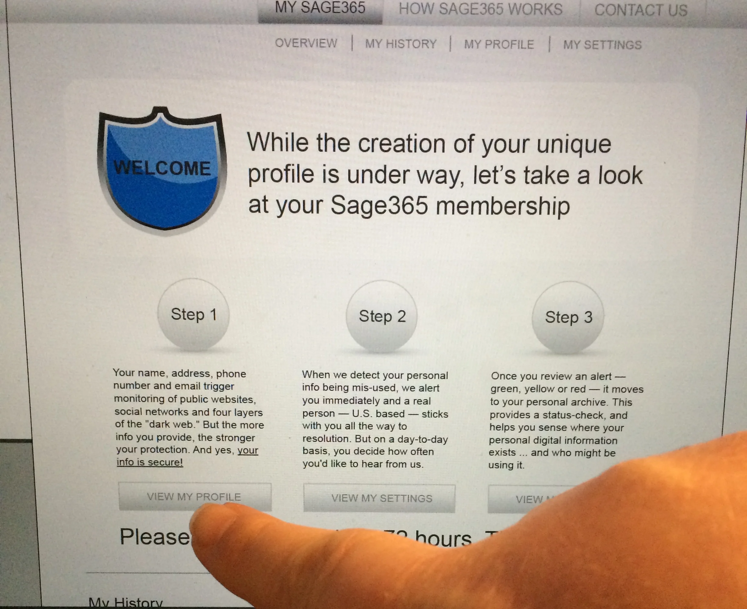
I worked on a high-level site map of the consumer side of Sage365. Knowing that we wanted to keep things very simple to use, I thought about how users would interact with the portal. I decided early on that I wanted it to be one scrolling page instead of multiple pages. I started with mobile first, and then backed into tablet and desktop. We had already decided that for the purpose of the MVP we would make a web app that would live in a shell in the app stores.
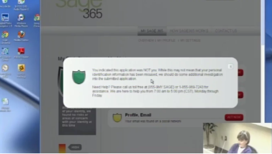
I spent a lot of time sketching wireframes on the white board and then converting them into high fidelity wireframes for our internal client. The business development team was in a hurry to have sales tools even before the product was out of its infancy so I acknowledged their needs as well as the users'. This is the flow for how the alerts work: An alert would be triggered if someone's name, phone number, address, email address, date of birth, Social Security number, or other financial accounts passed through one of our data vendors. The alert was a "is this you, or is this not you" type of wording so that a user can say, "yes, I bought a new car the other day," or "no, that was definitely not me." Alerts were delivered via the consumer's preference, either by email, app, text, phone call, or any combination of the four.
I pinned the navigation to the bottom of the screen so that users could easily navigate around the application. I wanted the interface to be familiar for users, so I utilized iOS functionality and look. Users would input their information on activation of the product, so this would be where changes could be easily made.
For the first round of user testing, I created a list of tasks that I wanted users to accomplish. Part of the business was a call center, and there were always willing testing participants. I wanted to really understand if they knew how to add more data points to their profile. I refined my original dashboard so that it included more information and directions for the first-time user after I finished that round of tests.
Our team worked with a marketing research group to do behind the glass user testing on our paper prototypes. We also had a few clickable digital wireframes for them to use for the testing. Part of the product is a phone call for help, which we were able to simulate in real time, the idea being that someone was available to help 24/7/365. These tests were very valuable. We had a lot of positive feedback from the users, and a few things that tripped them up. The users loved the fact that there was a chance to call when there was potential trouble. They also liked that there were several customer touch points via alerts, email, and texts.
Soon after our behind the glass testing, we found out that our product was no longer going to market. While I was working on the user experience and marketing, the product developer was testing the strength of the data sources. There were giant holes in the reporting and we couldn't in good faith let the product move forward. We worked on this project for more than 10 months, we learned a lot, but we also learned to trust our gut.